Color Spaces for better Viewing in iPhones and other Colorblind devices
Last night I edited vacation photos and uploaded them, noticing that the colors in the photos looked fine on the iMac in Dropbox, in Wordpress, and even more so after a new color calibration on the monitor. Then I noticed they were coming up greenish on the web in other places, and greenish on my phone. After researching a bit, I'm thinking the reason is because the icc profiles I'm assigning the photos upon saving is a color profile besides sRGB when it needs to be sRGB for better color viewing in iPhone or other programs like it. I'm writing this because now in my blog, my goal is to review techniques and project instructions with you as well as share some of the issues I come across. I mean, this blog needs a new purpose now that I'm out of school, and I don't mind teaching what I learn, so...voila. 📚 So let's see if I can show what I mean with the color profile issues before I move on to the first planned project....
Ok, so here is the same image with the same edits but saved in .jpg format with two different types of Color Spaces. The first was uploaded yesterday I to Instagram with a number of others and the color space used was ProPhoto RGB rather than sRGB. The images showed up much less saturated in my Instagram and Wordpress posts yesterday due to this issue. Look at the images below.

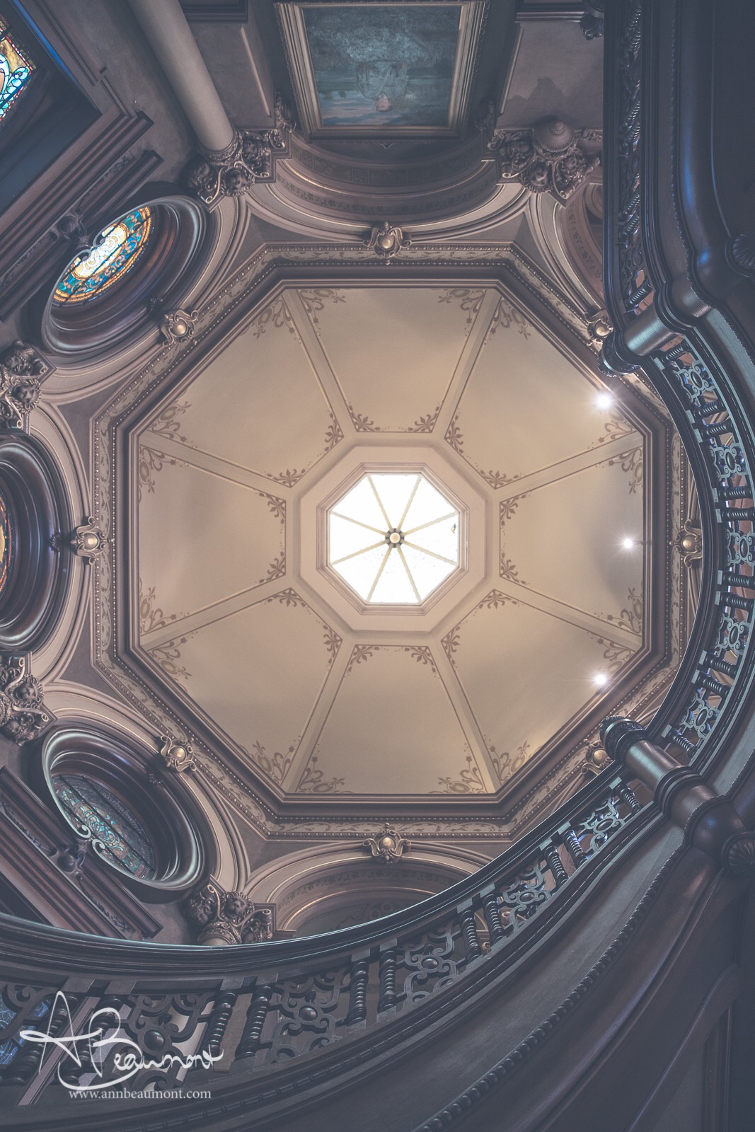

Looking at these images, do you notice the difference? The second shows up more saturated (if viewed from iPhone or other devices that can better register sRGB than other individual color profiles). Notice the slight blue hues more visible along the banister line toward the bottom left in the lower image versus the more gray version up top. The lower of the first two also shows a rosier hue overall, in my opinion. I've also added a third to note any difference in the colors from a "colorblind device" when using an Adobe sRGB (1998) Color Space, which I don't believe there are.